
Empowerment Engine
Your complete support system.
Human Factors Product Manager
Team: Cross-functional Product Design team of 5 including: Research & Design, Communications, Technical Development, Process Improvement, and myself as Project Manager.
Completed: August 2025
Project Length: 2 months
Project Brief: Partnered with Pranathi Perati, a molecular biologist and two-time pancreatic cancer survivor, to design a digital platform addressing a gap she identified firsthand: no single resource existed to help patients navigate clinical trials, genetic testing, and community support together. As Project Manager, I led a five-person cross-functional team through research, design, and prototyping to bring Pranathi's vision, a platform that makes support feel real and options visible, to life.
-
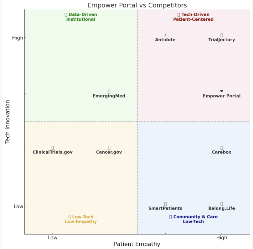
Patients newly diagnosed with pancreatic cancer, and the caregivers supporting them, face a fragmented information landscape: clinical trial databases, genetic testing resources, and peer support communities all live in separate places, each with its own dense, clinical language. Pranathi's own experience navigating this as both a scientist and a patient made clear that existing tools were either data-driven but cold (ClinicalTrials.gov, EmergingMed) or warm but low-tech (peer support platforms), nothing combined clinical accuracy with genuine empathy. Our objective was to build a single platform that simplified trial search and genetic testing information while feeling human, trustworthy, and usable by someone in crisis.
-
Research & Discovery
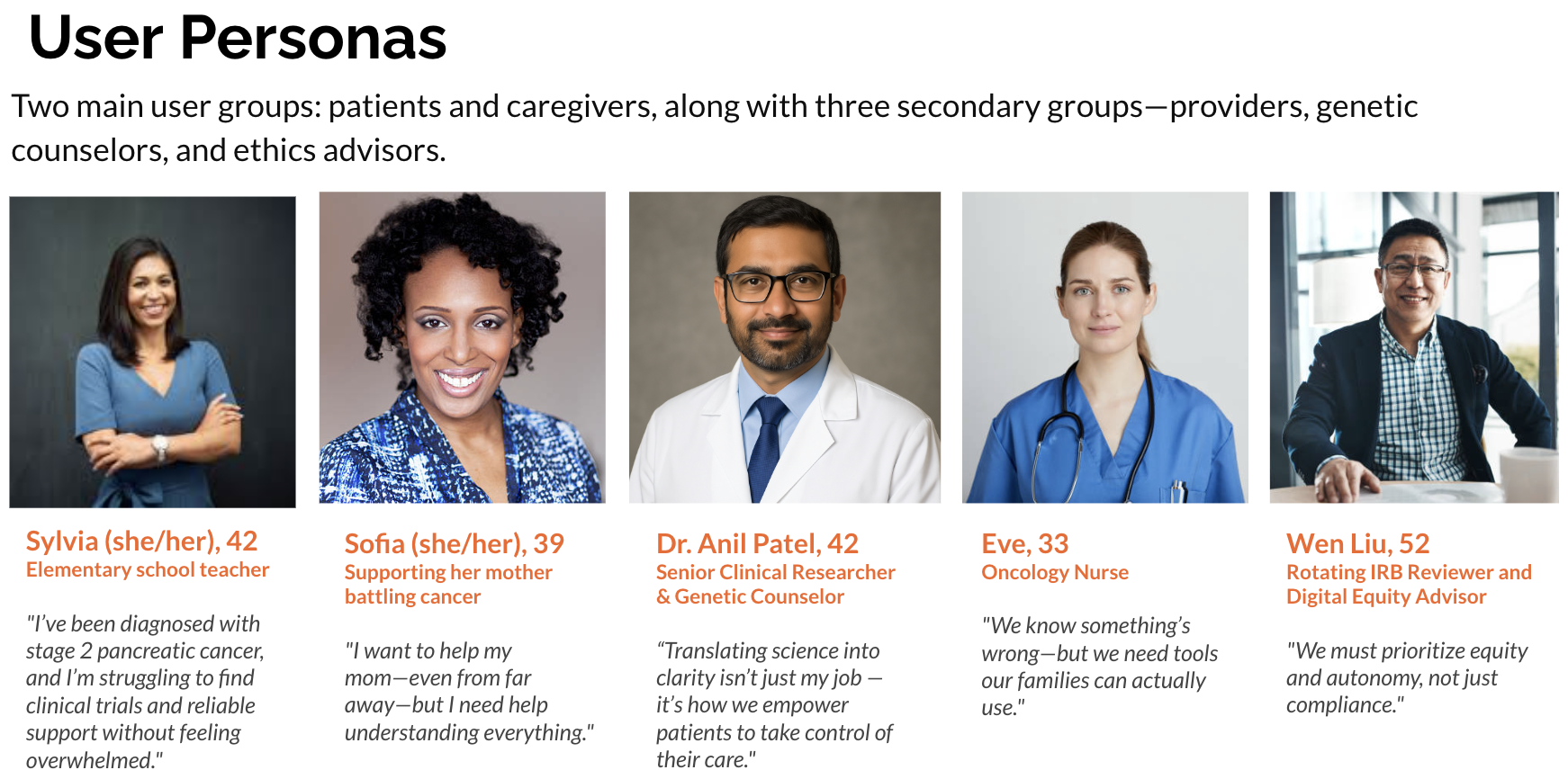
We began with client discovery sessions with Pranathi to understand her lived experience, followed by a competitive landscape analysis mapping existing tools by tech innovation and patient empathy, which confirmed the gap she'd identified. We conducted a literature review and built five user personas with distinct needs we'd need to design for simultaneously.
Defining Requirements
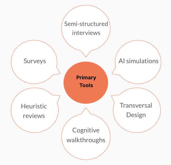
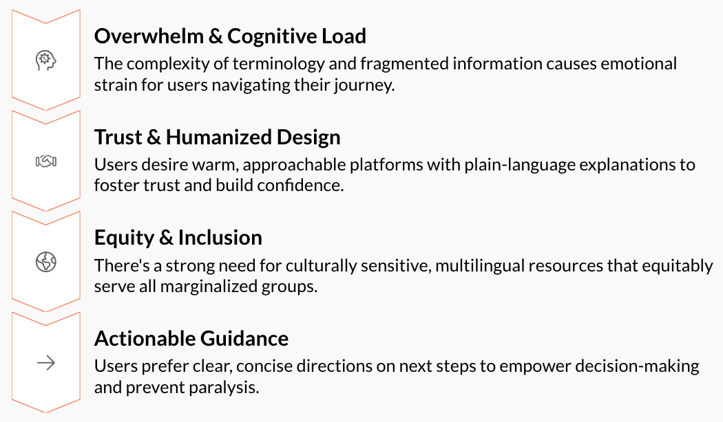
Through semi-structured interviews, surveys, heuristic reviews, and cognitive walkthroughs, we identified four recurring themes across every user group: cognitive overwhelm from clinical terminology, the need for trust through humanized design, gaps in equity and inclusion for marginalized groups, and a consistent preference for clear, actionable guidance over dense information. We translated these into concrete design requirements: a plain-language Trial Finder, a caregiver-focused "Your Circle" dashboard, provider-friendly printable summaries, and accessibility and multilingual support built in from the start, not bolted on.
Prototyping & Brand Development
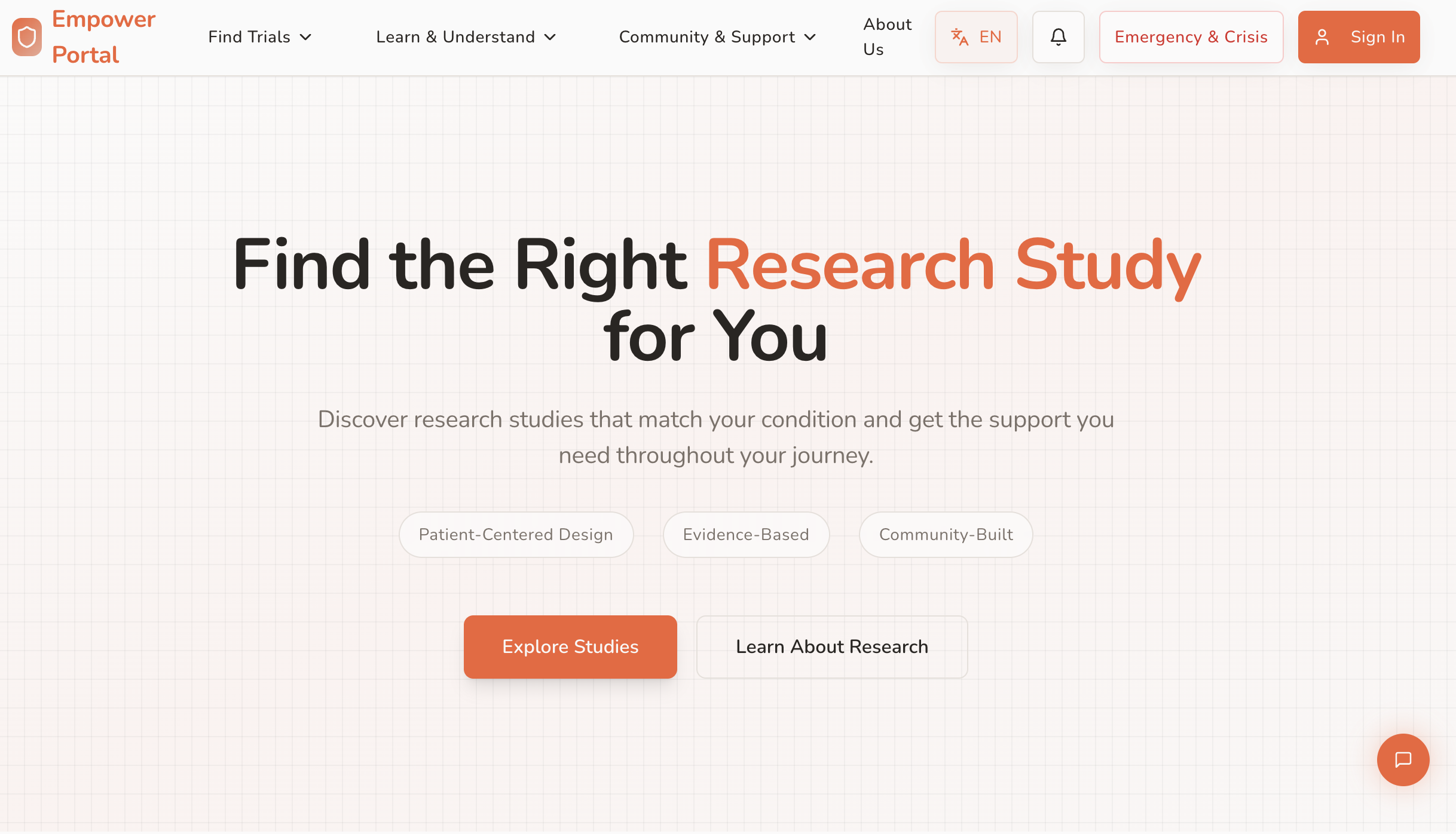
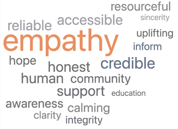
We built out a full design system around three core principles: simplify, support, empower. With a warm, minimalist visual identity (coral-orange and mint palette, clean sans-serif typography) intended to feel human rather than institutional. The prototype was built to walk through the full patient journey: discovery, trial search and comparison, genetic testing information, and ongoing community and wellness support.
-
Designed and delivered the Empower Portal, a patient-centered digital platform including:
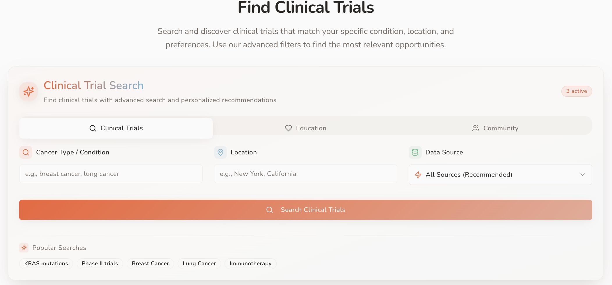
Advanced clinical trial search with AI-powered matching, real-time sync, and side-by-side trial comparison
Simplified genetic testing information connecting predisposition data to personalized treatment options
"Your Circle," a caregiver dashboard with care coordination, medication tracking, and a peer support community
Accessibility features including screen reader compliance, multilingual content, and role-specific interfaces for patients, caregivers, and providers
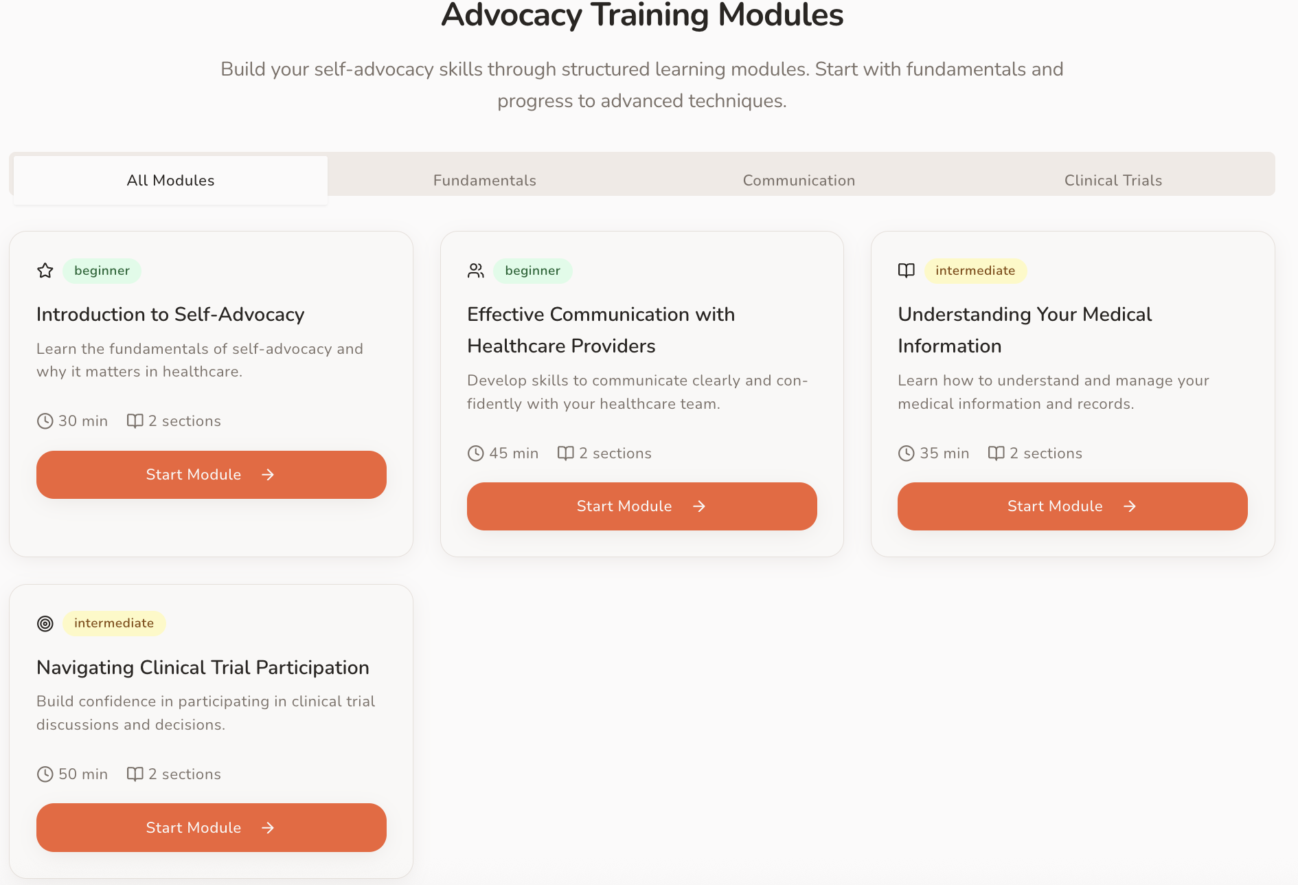
Self-advocacy resources, including templates for appointments and communication with care teams
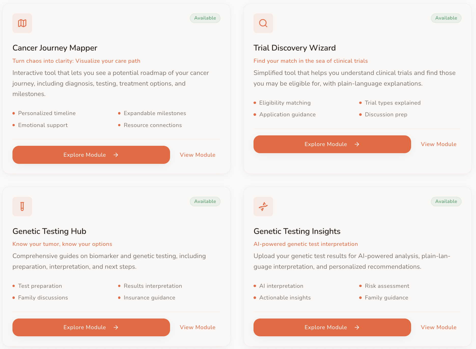
Empower Engine beta
A note on this prototype: Empower Portal was built as a working prototype within a two-month academic timeline, not a production-ready product. It may run slow and some features still have known bugs, and a few areas remain untested due to access limitations. We're sharing it here as-is because it reflects the real, iterative state of the design process, not a polished final product.
Deliverables
Feedback & Reflection
User Testing & Feedback
Trial Finder: Users found relevant trials in 2–3 steps with confidence; navigation was clear and intuitive
Save & Compare: Save functionality worked well, but the Compare tab failed to display selected trials
Genetic testing information: Content was clear and reassuring, though document upload remained untested due to access limitations
"Your Circle": Users added contacts easily and found the interface supportive, but contacts disappeared after a page refresh
Help Center: Users located support and submitted feedback without issue
Accessibility: Font size toggle and screen reader compatibility both met basic WCAG standards
Despite the bugs surfaced, Pranathi found the portal easy to use and genuinely empowering — feedback that confirmed our core goal of making trial access feel possible, not overwhelming
Reflection
This project put me in charge of translating one person's deeply personal mission into a product a five-person team could actually build. Pranathi wasn't just our client, she was a molecular biologist who'd navigated two pancreatic cancer diagnoses largely on her own, cobbling together clinical trial databases, genetic testing resources, and patient communities that were never designed to work together. Keeping her lived experience at the center of every design decision, while managing a team spanning research, communications, technical development, and process improvement, meant constant translation between disciplines and constant checking of our own assumptions against what she actually needed.
Two months is a tight runway for a platform this ambitious, five user groups, each with different needs, all needing to feel like one coherent product rather than five different tools stitched together. Usability testing exposed that tension clearly: the trial search and accessibility features held up well, but features like Compare and Your Circle broke under real use, a reminder that empathetic design and functional design have to be built and tested together, not sequentially. What I'm proudest of isn't that everything worked, it's that even with a rough prototype, Pranathi described the platform as making her feel like options were visible and support was real. That was always the actual goal, and it's the standard I want to hold product work to going forward: not just does it function, but does it make someone's hardest moment feel a little more navigable.